Understanding Foldable Form Factors
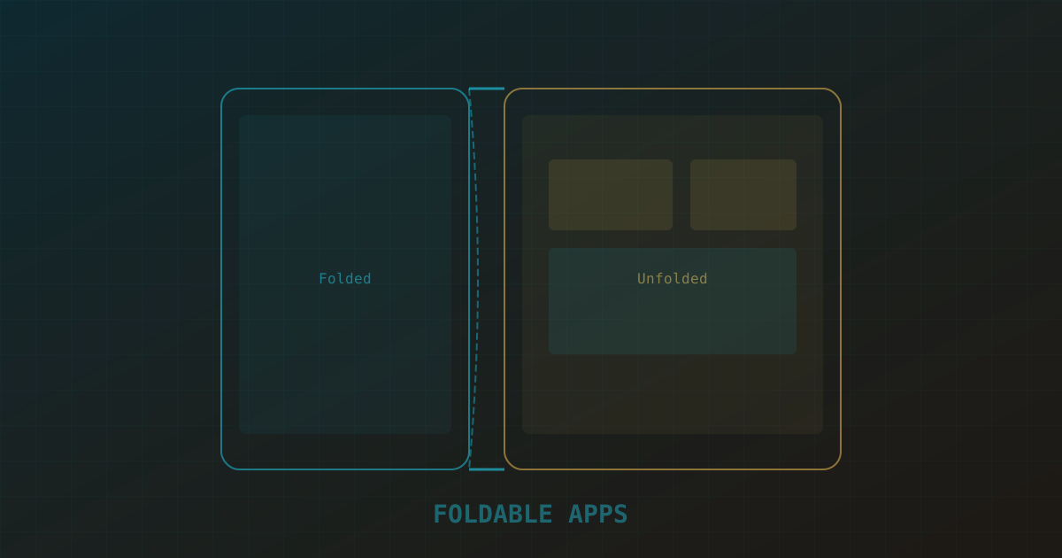
Foldable phones aren't just bigger phones — they're devices that push Android app development to transition between multiple form factors during a single session. The Samsung Galaxy Z Fold unfolds from a 6.2-inch cover screen to a 7.6-inch inner display. The Galaxy Z Flip folds from a full phone into a compact 3.4-inch cover screen. The Google Pixel Fold and OnePlus Open follow similar patterns.
These devices have distinct postures: folded (closed, used like a normal phone), unfolded (open, tablet-like), half-folded/tabletop (folded at ~90 degrees, resting on a surface), and flex mode (partially folded at various angles). Each posture suggests different interaction patterns. In tabletop mode, the top half of the screen is ideal for content display while the bottom half becomes a control surface. Your app should adapt to these postures gracefully.
Jetpack WindowSizeClass for Adaptive Layouts
Android's Jetpack Compose, built on Kotlin, provides WindowSizeClass as the primary mechanism for building adaptive layouts. It categorizes the available screen width into three buckets: Compact (0-599dp), Medium (600-839dp), and Expanded (840dp+). Folded foldables typically fall into Compact, while unfolded ones land in Expanded.
@Composable
fun AdaptiveScreen(
    windowSizeClass: WindowWidthSizeClass =
        calculateWindowSizeClass(activity = LocalContext.current as Activity).widthSizeClass
) {
    when (windowSizeClass) {
        WindowWidthSizeClass.Compact -> {
            // Single-pane layout — list view
            ProductListScreen()
        }
        WindowWidthSizeClass.Medium -> {
            // Two-pane layout — list + detail side by side
            TwoPaneLayout(
                start = { ProductListScreen() },
                end = { ProductDetailPlaceholder() }
            )
        }
        WindowWidthSizeClass.Expanded -> {
            // Three-pane or wide two-pane layout
            ThreePaneLayout(
                categories = { CategoryList() },
                products = { ProductListScreen() },
                detail = { ProductDetailPane() }
            )
        }
    }
}
The key principle is that your layout should respond to available space, not to a specific device. Don't check "is this a foldable?" — check "how much space do I have?" This approach works across foldables, tablets, Chromebooks, and desktop mode simultaneously.
Samsung Foldable SDK and Device Posture
For foldable-specific features beyond window size, Samsung provides the Galaxy Foldable SDK and the Jetpack WindowManager library's FoldingFeature class. These APIs expose the device's physical posture — fold angle, hinge position, and whether the device is in tabletop or flex mode.
class MainActivity : ComponentActivity() {
    private lateinit var layoutInfoFlow: StateFlow<WindowLayoutInfo>

    override fun onCreate(savedInstanceState: Bundle?) {
        super.onCreate(savedInstanceState)

        layoutInfoFlow = WindowInfoTracker.getOrCreate(this)
            .windowLayoutInfo(this)
            .stateIn(scope = lifecycleScope, started = SharingStarted.Eagerly,
                     initialValue = WindowLayoutInfo(emptyList()))

        setContent {
            val layoutInfo by layoutInfoFlow.collectAsState()

            val foldingFeature = layoutInfo.displayFeatures
                .filterIsInstance<FoldingFeature>()
                .firstOrNull()

            when {
                foldingFeature?.state == FoldingFeature.State.HALF_OPENED -> {
                    // Tabletop mode — split content vertically
                    TabletopLayout(
                        topContent = { VideoPlayer() },
                        bottomContent = { PlaybackControls() }
                    )
                }
                foldingFeature?.orientation == FoldingFeature.Orientation.VERTICAL -> {
                    // Book posture — use hinge as a separator
                    BookPostureLayout(hingeBounds = foldingFeature.bounds)
                }
                else -> {
                    // Flat / normal posture
                    StandardLayout()
                }
            }
        }
    }
}
The FoldingFeature.bounds property gives you the exact hinge location in pixels, which you can use to avoid placing interactive elements under the fold or to create natural visual separations that align with the physical hinge.
Multi-Window and Continuity
Foldable users frequently run apps in split-screen or free-form window mode. Your app must handle arbitrary aspect ratios and window sizes gracefully. Test with your app at 50% width, in a small floating window, and in portrait orientation on an unfolded device.
Continuity is the experience of your app maintaining state seamlessly as the user folds and unfolds the device. When the device transitions from unfolded to folded, your activity receives a configuration change. Save and restore state properly using onSaveInstanceState or Compose's rememberSaveable. The transition should feel instantaneous — no loading screens, no data loss, no layout jumps.
// In AndroidManifest.xml — handle config changes gracefully
<activity
    android:name=".MainActivity"
    android:configChanges="screenSize|smallestScreenSize|screenLayout|orientation"
    android:resizeableActivity="true">
</activity>
Testing with Android Studio AVD
Android Studio's emulator includes foldable device profiles. You can create AVDs that simulate the Galaxy Z Fold 4, Galaxy Z Flip, and generic foldable form factors. The emulator lets you simulate fold/unfold transitions, change the fold angle, and test multi-window configurations.
In the emulator controls, use the "Fold" and "Unfold" buttons to transition between postures. The "Fold Angle" slider lets you test flex mode at any angle. Enable "Show device folds" in the emulator settings to visualize the hinge area. Test your app at every posture transition and verify that state is preserved, layouts adapt smoothly, and no UI elements are clipped by the hinge.
Best Practices and Common Pitfalls
These patterns will save you from the most common foldable development mistakes:
- Don't assume screen size is static. Users fold and unfold during a session. Your layout must recompose dynamically.
- Avoid the hinge. Never place a button, text input, or critical UI element directly under the fold. Use
FoldingFeature.bounds to calculate safe zones.
- Support all aspect ratios. Folded, your app might be tall and narrow (21:9). Unfolded, it might be nearly square (4:3). Test both extremes.
- Test with TalkBack and keyboard. Foldable devices in tabletop mode are sometimes used as mini-laptops with Bluetooth keyboards. Ensure keyboard navigation works.
- Optimize for one-handed use in folded mode. The cover screen is a phone — place primary actions within thumb reach.
Foldable devices are still a niche market, but they're growing — Samsung shipped over 10 million foldables through 2023, and Google's Pixel Fold brought mainstream attention to the category. Building adaptive layouts now positions your app for the future of mobile hardware, and the responsive patterns you implement for foldables also improve the experience on tablets and Chromebooks. Our Android developers can help you audit an existing app for foldable readiness.